This is a meaningful assignment to me because i got to spend a lot of time with myself walking around just taking photos and immersing in occurances happening around me. I get to pay attention to details which I normally wouldn't have noticed, and added bonus- I talked to a lot of strangers!
This series of photos are taken over a span of 2 Sundays, during my 4 week work at mbs. I got to walk around and explore the marina bay sands shoppe mall during my 2 hour break and I found some interesting features.

trying out shallow depth of field photo, but my camera is too lousy to be able to do that...

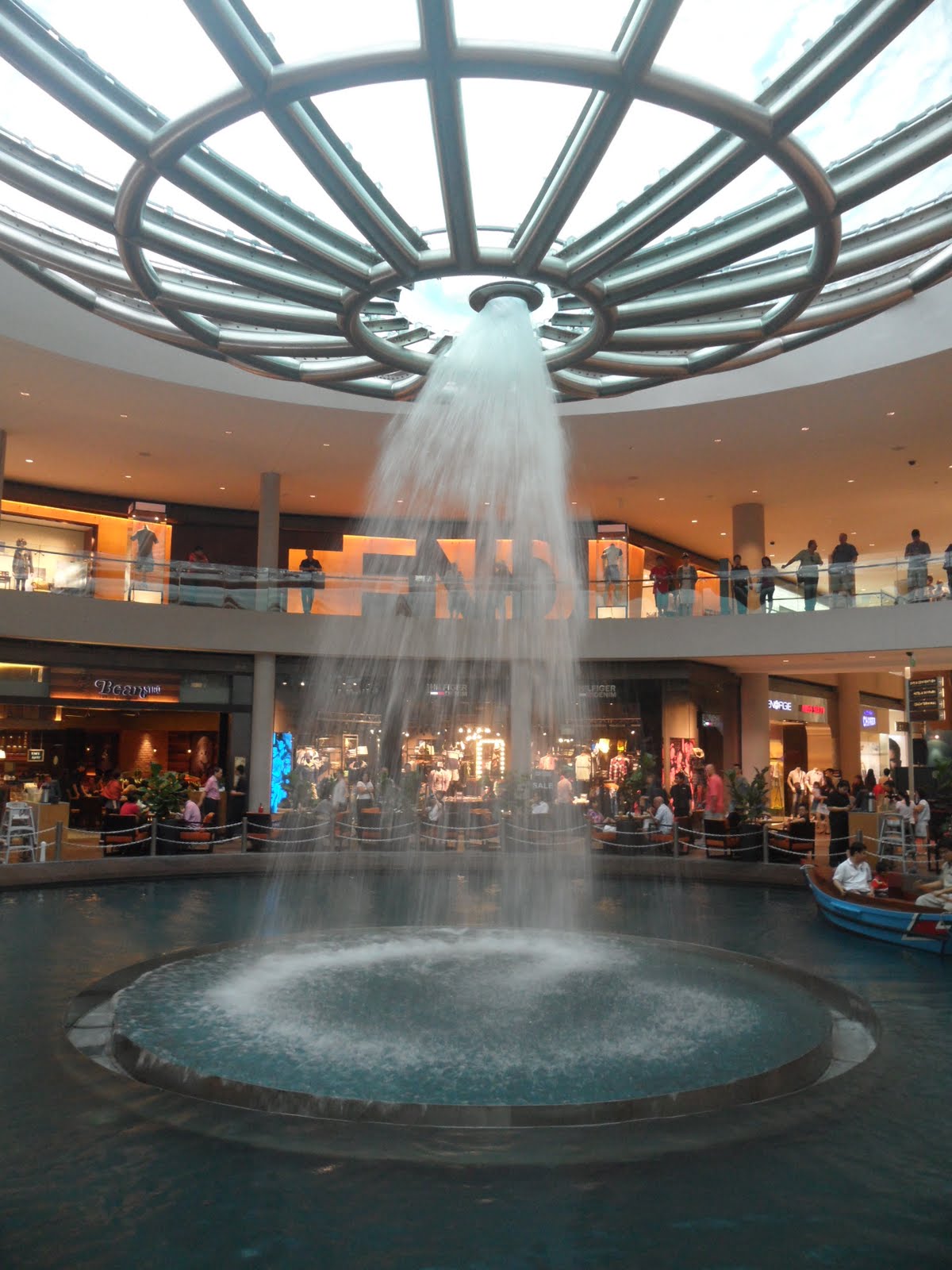
the giant flushing system.

stil doesn't look nice somehow.

inside of the giant flushing system. I wanted to get a freeze action shot for this, but again, my camera is too lousy to be able to capture it.

In the spur of that moment, just nice a boat was passing by I thought it would be nice to capture this in a shallow depth of field.

this actually became one of my choices for post editing for shallow depth of field photo.


tried a different perspective, tried to take people through the bowl, didn't turn out nice.

deep depth of field, with no meaning...

I meant for this photo to be shallow depth of field, but my camera really did not allow me to do so, so i thought post editing would work it.

but if you enlarge it, it is quite obvious along the edges of the float at the wires that this is not a natural shot. So painfully, I threw this photo away.


This became one of my choices too. SHall upload the final image later.

Just another angle, in case the first one wasn't taken properly.

shallow depth of field. taken while i was in the bus home.
those were pretty much the end of the first try. Photos which I didn't select as my choices.
-
I had a much more fruitful 2nd weekend of shooting though.
And lucky me, a colleague lent me her G12 during break before it died. So I managed to capture a freeze shot of the water.

tried with glass and liquid.

Lucky me chanced upon the NTUC kite flying festival.

This is really not a backside shot because I really did talk to him. But the kite was too far away to be taken with him in the photo...

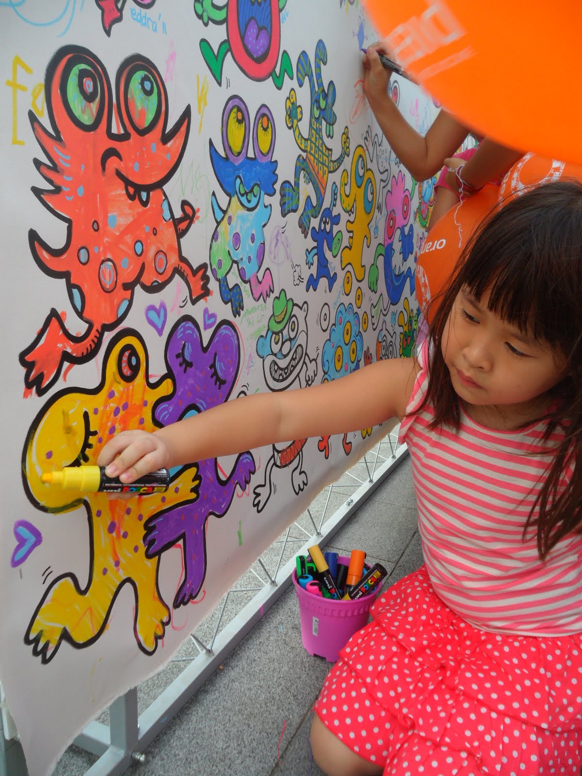
Couldn't take a shallow depth of field photo with my camera, intended to focus on the words and blur the kids actually.

Side track- the artist of all the drawings who came to talk to me while i was colouring. He kept finding new colored pens to pass to me to color, so when I finished coloring my monster I walked down and realised this cartoon that he was coloring. Asked him if he was an artist, and he said he drew all these. Even showed me his photobook of experience.

Sidetrack- Decided to sign my name there.

Love how the sun shines in the sky, but this photo can't be used in assignment one... :(


Then I got the captain to pose for me but I wasted the opportunity as my photos were all focusing on the wrong things or just didn't work. It was not really nice to make him pose there for much longer, so just too bad. I would have loved a photo with him in it though.


used the micro function from my camera. weisheng happened to be right here at the same time too sitting somewhere with the kids on the left, but we didn't see each other on the day at all.


motion blur.
I ommited a lot of photos if not this entry will be toooooo long.
-
It was a really tough choice because due to the limitations of my camera, I had to rely on post editing. So when I took the photos I could only use my imagination to picture how it would turn out. What I did therefore was just shoot shoot and shoot. So I ended up with a wide variety of shots for each of the 4 different types we were supposed to shoot.
The following are the choices which I narrowed down to.
Freeze action:
FA00

FA01

FA02

FA03
Since I thought the focus should be on the water, I chose the first one.
Motion Blur:I did not want to do on cars initially, because I thought it wouldn't be special. But I took some photos of them anyway, and managed to get some rather nice looking ones.

MB00

MB01

MB02 i like the highway feel of this photo.

MB03
In the end, I chose between MB00 and 01 because I thought the CBD background added to the value of the photo, instead of just having cars in blur motion.
Shallow depth of field:This genre had the widest variety in terms of photos from different settings.

SDOF00

SDOF01 - but what's the significance of cigarettes in the dustbin?

SDOF02 - I really liked the context of this photo, but I thought if I were to blur the background, then the people coloring will not be seen clearly, and the photo kind of loses it's meaning.

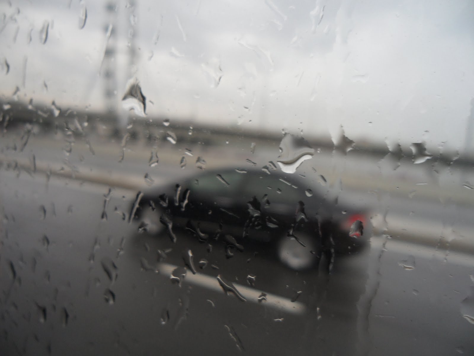
SDOF03 - rainy day, lonely car on the highway. This is a secondary choice, but nothing very special about it I feel.

SDOF04

SDOF05

SDOF06 - my final choice

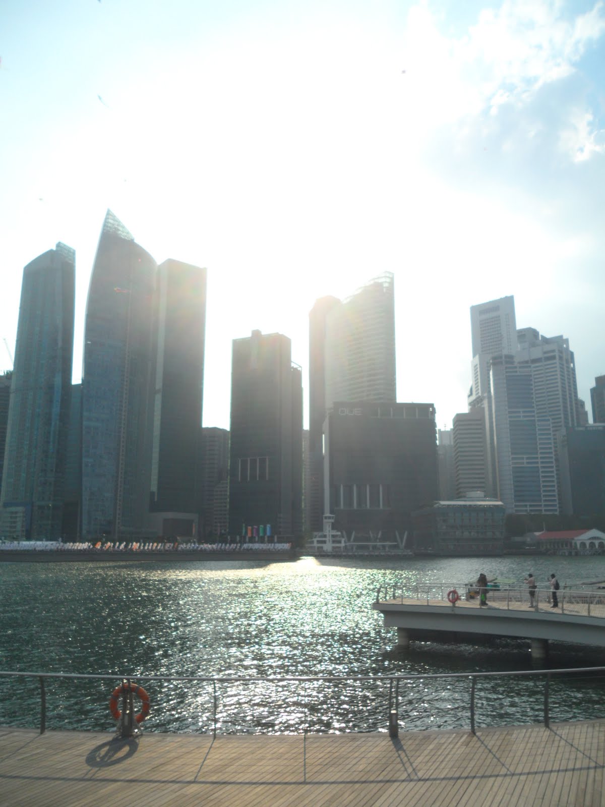
SDOF07 - love the evening glow on the waters.

SDOF08
it was a really tough choice but in the end I chose the boat photo, and another one which i will show later.
DEEP DEPTH OF FIELD:This is the one that was the most difficult to me because I really didn't understand how it was supposed to be. The only reference I had was the mountain and waterfall photo jing showed in class. Did a google search too but...

DDOF00

DDOF01

DDOF02

DDOF03

DDOF04

DDOF05

DDOF06

DDOF07

DDOF08 - too dark

DDOF09

DDOF10 - already used the boat photo for SDOF

DDOF11 - water not a good idea to show ddof

DDOF12 - too dark too?

DDOF13

DDOF14

DDOF15

DDOF16 - this looks so singapore tourism board promotional photo

DDOF17
Here are my final choices.
After much heavy editing of all the photos,
Shallow depth of field:

1

2 - made the photo darker and by accident, the orange warm evening glow showed even more. Pleasant surprise.
But almost everyone i surveyed told me 2. So 2 it shall be.
Freeze action:

cropped it a little due to the advertisement at the bottom of the photo and I rotated it 180 degrees, I thought it would be more unique in this direction. Edited the contrast such that it looks more highly contrasted now to give it a strong look and the luminosity of the color blue.
Deep depth of field:

not really to the theme i guess. Furthermore, I think it is too dark to see.

:/
EDIT: Here's my deep depth of field photo.

Motion blur:

I actually prefer this photo, but the percentage of motion blur taking up this photo is too little, so I had to use the next one,

but the top of the building is cut off. So I merged the two together instead.

Final!